The Biggest Myth About Cheap-Looking Tile Stickers and How to Avoid It
Let’s start with the honest thought most people won’t say out loud:
“Tile stickers sahi hain… but thoda cheap lagta hai na?”
If you’ve ever felt this, you’re not alone.
In fact, this is the #1 hidden objection stopping people from buying.
Not price.
Not durability.
👉 Perception.
Because no one wants their home to look like:
- “Jugaad renovation”
- “Temporary fix”
- “Budget hack gone wrong”
Everyone wants:
👉 “Aisa lage ki proper interior designer ne kiya hai.”
So let’s clear this once and for all.
The Truth: Tile Stickers Don’t Look Cheap Bad Choices Do
This might sound blunt, but it’s true.
👉 Tile stickers don’t look cheap by default.
👉 They look cheap when the wrong ones are used the wrong way.
And once you understand why, you’ll never make that mistake again.
Why Some Tile Stickers Look Fake (And Ruin the Whole Space)
Let’s break down what actually makes tiles look “cheap.”
- Thin Material = Flat, Plastic Look
This is the biggest giveaway.
Cheap tile stickers are:
- Paper-thin
- Completely flat
- No depth or texture
What happens:
- Light doesn’t reflect properly
- Surface looks artificial
- From a distance, it screams “sticker”
Real-life example:
You’ve probably seen those glossy, super-thin tiles on marketplace listings.
They look amazing in edited photos.
But in real life?
👉 They look like printed plastic sheets.
- Over-Glossy Finish (Too Much Shine = Fake Look)
Shine is tricky.
A little shine = premium
Too much shine = cheap
Cheap tiles often have:
- High-gloss plastic coating
- Uneven reflection
Result:
Instead of looking like ceramic, they look like:
👉 Laminated paper
- Poor Design & Print Quality
Design matters more than people think.
Common problems:
- Repeating patterns (looks artificial)
- Unrealistic colors
- Low-resolution prints
Result:
Even if the material is okay, the design gives it away.
- Bad Installation (Even Good Tiles Can Look Cheap)
This is where most people sabotage themselves.
Mistakes like:
- Uneven alignment
- Visible gaps
- Air bubbles
Result:
Even premium tiles start looking like:
👉 DIY gone wrong
The Material Game: PVC vs Polyurethane (This Changes Everything)
Now let’s talk about something most brands won’t explain properly.
👉 Material = 50% of the final look
PVC Tiles (Common & Cheap)
Most low-cost tiles are made of PVC.
Pros:
- Affordable
- Lightweight
Cons:
- Flat appearance
- Less depth
- Can feel “plasticky”
- Lower durability
👉 This is where the “cheap look” usually comes from.
Polyurethane Tiles (Premium Category)
This is where things change.
What makes them different:
- Thicker structure
- Slight 3D depth
- Better surface finish
- More realistic texture
Result:
- Better light reflection
- More “tile-like” feel
- Premium appearance
👉 This is why higher-quality tiles instantly look different even to an untrained eye.
Simple Way to Understand
PVC = Printed sheet
Polyurethane = Structured surface
👉 And your eyes can tell the difference instantly.
Lighting Hacks: The Secret No One Talks About
Even the best tiles can look average in bad lighting.
And average tiles can look amazing in the right lighting.
How Light Affects Perception
Tiles don’t just sit on your wall.
They interact with:
- Natural light
- Artificial light
- Shadows
Mistake People Make
Installing tiles in:
- Dark corners
- Poor lighting
- Yellow dim bulbs
Result:
- Texture disappears
- Surface looks flat
- Cheap feel increases
What You Should Do Instead
- Use White or Neutral Lighting
- Enhances texture
- Shows depth
- Add Under-Cabinet Lights (Kitchen Hack)
- Creates shadow lines
- Makes tiles pop
- Avoid Harsh Direct Light
- Too much glare = artificial look
👉 Lighting alone can upgrade your space by 30–40%.
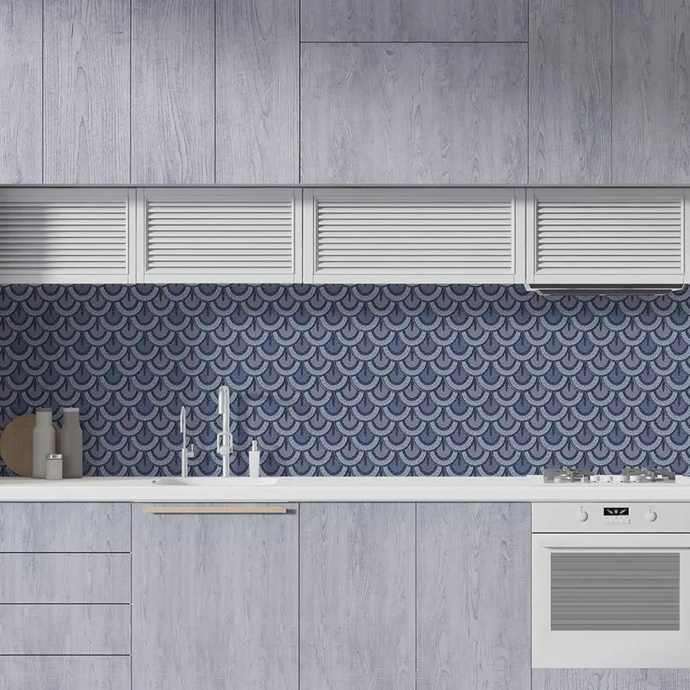
Placement Mistakes That Make Tiles Look Cheap
Where you install matters as much as what you install.
Wrong Approach
People try to:
- Cover entire walls randomly
- Mix too many designs
- Ignore spacing
Result:
👉 Visual clutter = cheap feel
Smart Placement Strategy
- Focus Areas Only
- Kitchen backsplash
- TV background
- Wash basin wall
- Keep It Clean
- Don’t overdo patterns
- Let tiles “breathe”
- Match With Surroundings
- Cabinets
- Wall color
- Lighting
👉 Good design is not about adding more.
👉 It’s about placing correctly.
Design Selection Tips (This is Where Most People Go Wrong)
Choosing the wrong design can ruin everything.
Let’s simplify it.
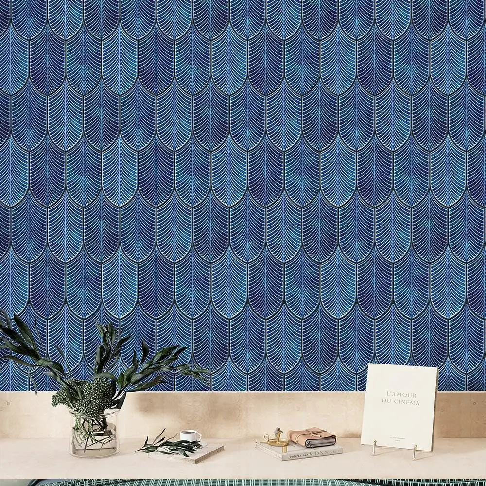
Matte vs Glossy What to Choose?
Matte Finish:
- Subtle
- Premium feel
- Less reflection
- Safer choice
👉 Best for:
- Modern homes
- Minimal designs
Glossy Finish:
- Reflective
- Slightly bold
- Can look premium if balanced
👉 Best for:
- Small spaces (adds brightness)
Rule of Thumb
👉 If you’re confused go matte.
It’s harder to go wrong.
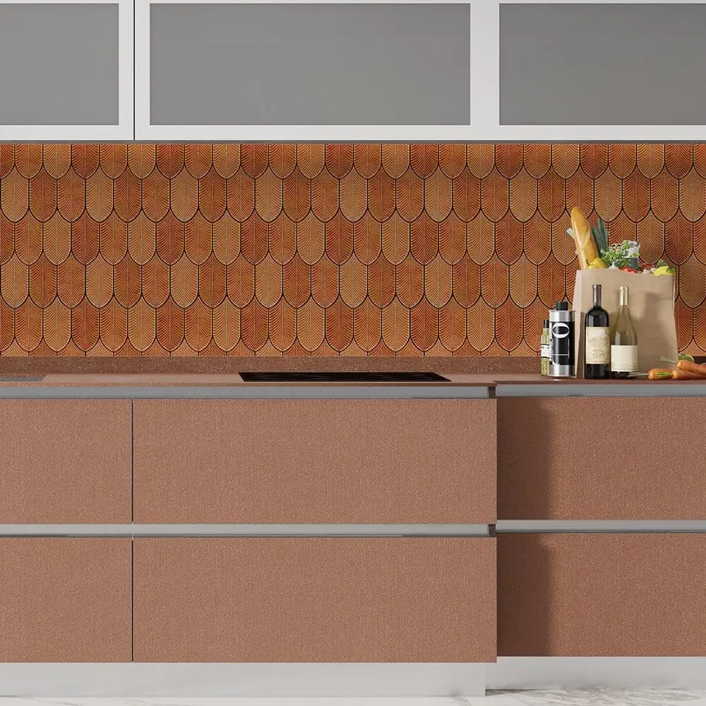
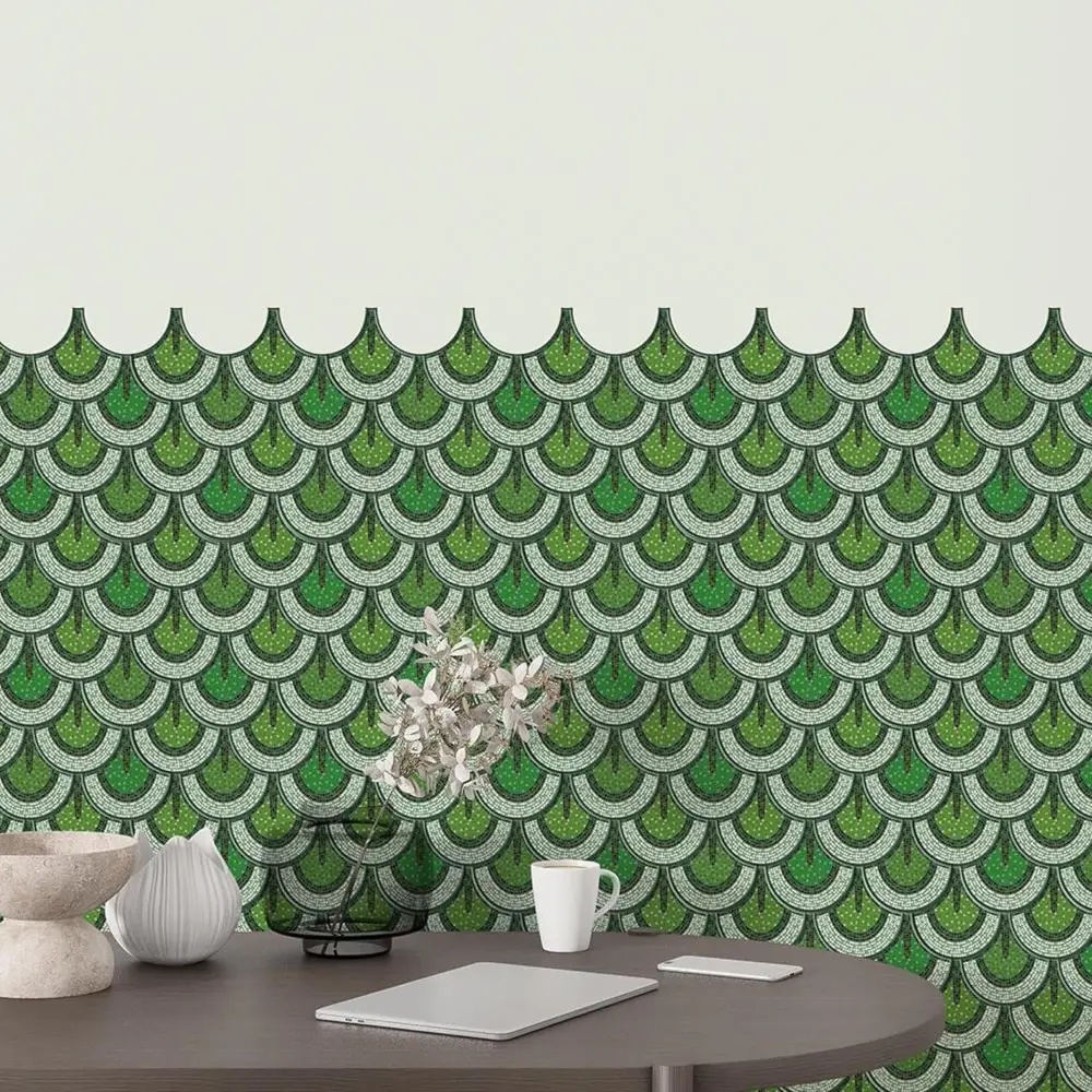
Pattern Selection Tips
Avoid:
- Overly busy designs
- Loud colors
- Repeating obvious patterns
Choose:
- Neutral tones
- Subtle textures
- Realistic stone/marble looks
👉 Simple always looks expensive.
The Real Reason People Say “Cheap Lagta Hai”
It’s not the product alone.
It’s usually a combination of:
- Low-quality material
- Bad lighting
- Poor installation
- Wrong design
Fix these four and the entire perception changes.
A Simple Transformation Example
Two kitchens.
Same layout.
Kitchen A:
- Thin PVC tiles
- Glossy finish
- Poor lighting
- Uneven installation
👉 Result: Cheap look
Kitchen B:
- Thicker tiles
- Matte finish
- Proper lighting
- Clean alignment
👉 Result: Premium feel
Same concept. Different execution.
Final Thought
If you’ve been avoiding tile stickers because:
👉 “Log kya bolenge, cheap lagega…”
Now you know:
It’s not about the product.
👉 It’s about the choices you make.
Make the right ones, and:
- Your space won’t look “budget”
- It will look intentional
And that’s what good design is.
🚀 Biggest Mistake You’re Making
You’re ignoring the visual perception game.
People don’t buy tiles.
👉 They buy how their home will look to others.
⚡ Quick Win You Can Implement Today
Create a reel:
Hook:
👉 “Why your tile stickers look cheap (and how to fix it)”
Show:
- Bad vs good examples
👉 This will instantly boost trust + engagement.